WE RESPECTFULLY ACKNOWLEDGE THE WURUNDJERI PEOPLE OF THE KULIN NATION, WHO ARE THE TRADITIONAL OWNERS OF THE LAND ON WHICH ARTHAOS’ OFFICE IS LOCATED. SOVEREIGNTY WAS NEVER CEDED. AUSTRALIA ALWAYS WAS AND ALWAYS WILL BE, ABORIGINAL LAND.
Providing hydration essentials to anyone who needs it, no matter their lifestyle.
BACKGROUND
Optimising health for the imperfectly perfect lifestyle, Vitadrop’s health and wellness products are here to help you pave the way to a better you – one drop at a time.
THE OPPORTUNITY
How can we refresh Vitadrop’s branding so it catches consumers’ eyes and reflects their vision oftotal acceptance?
THE APPROACH
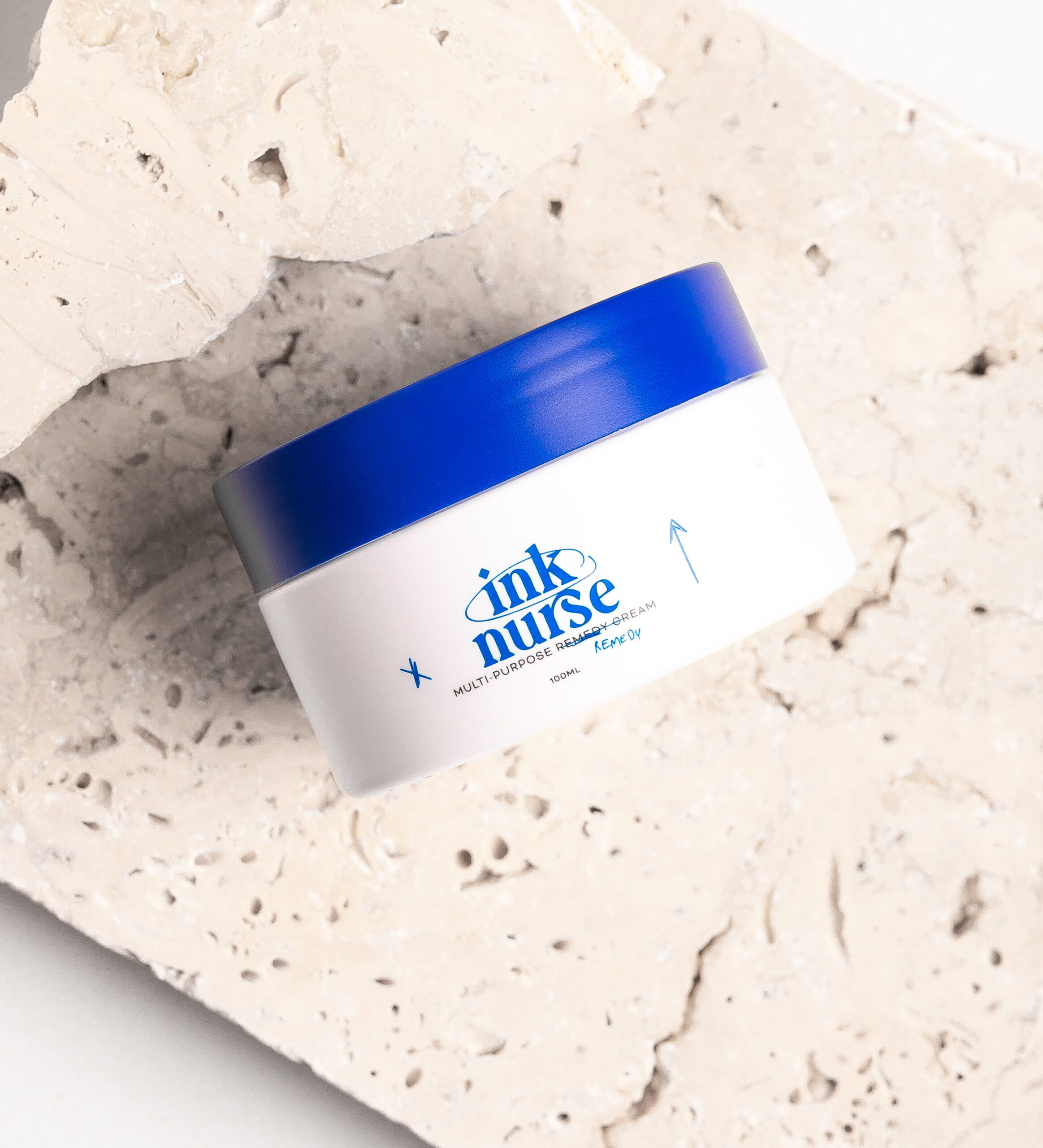
Vitadrop is dedicated to supporting those leading busy lifestyles, whether they’re fitness enthusiasts, partygoers, or anyone who wants more out of life. We were tasked with refreshing Vitadrop’s brand identity and packaging after completing a comprehensive brand strategy. With their commitment to health and vitality, we designed a bold logo that uses a unique Sans Serif font to visually communicate our brand’s adaptability and ability to go against the grain in health and wellness.
Our vibrant, fluid colour palette is designed to be used together and not as separate colours. We utilized gradients to showcase each colour’s complementarity, just as the ingredients within our product work together. We also designed icons as a wayfinding system for our product categories, utilizing organic, soft, and clean finishes to create a recognizable system for our customers. The gradients are at the core of our branding and can be used across all branding collateral, adapting, and expanding as the product does.
At the core of Vitadrop’s branding is the concept of inclusivity, recognizing that health and wellness should be accessible to everyone. Vitadrop encourages its community to live authentically, even if that means indulging in guilty pleasures. We reflected this approach in their imagery, capturing moments of different lifestyles and creating a balanced approach to living healthily. The imagery should feel clean, bright, optimistic, and lively, leaving you feeling like you woke up from a night of drinking and noticed Vitadrop working its magic.